Is Bitcoin Rainbow Chart Reliable? Analyst View
The Bitcoin rainbow chart has become one of the most recognizable technical analysis tools in the cryptocurrency community. This logarithmic visualization uses color-coded bands to represent different price valuation zones, from deep red (undervalued) to dark purple (overvalued). But does this popular indicator actually work, or is it merely a pretty visualization that gives false confidence to traders? Understanding its reliability requires examining both its methodology and real-world performance across multiple market cycles.
Created by designer Plan B and later refined by other analysts, the rainbow chart attempts to identify overbought and oversold conditions in Bitcoin’s price history. The chart has gained significant traction on social media and trading platforms, with many investors using it as a primary decision-making tool. However, the question of whether it provides genuine predictive value or simply fits historical data remains hotly debated among cryptocurrency professionals.
What Is the Bitcoin Rainbow Chart
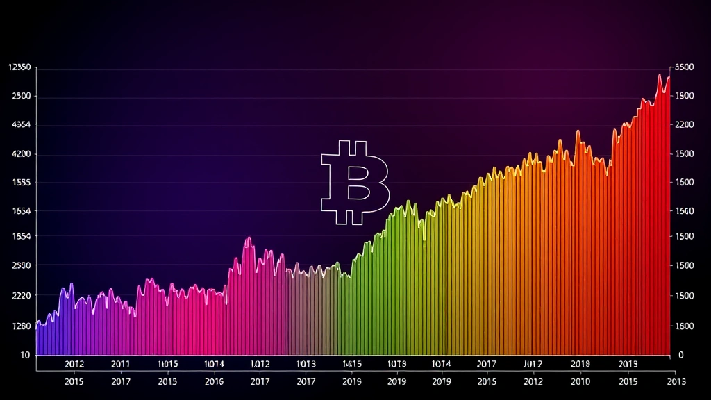
The Bitcoin rainbow chart is a logarithmic price chart that overlays colored bands representing different valuation levels for Bitcoin. Each color represents a specific price range and psychological state of the market. The bands range from dark red at the bottom (representing severe undervaluation and panic selling) through various shades of orange, yellow, green, cyan, and blue, up to dark purple at the top (representing extreme overvaluation and euphoric buying).
The chart uses a logarithmic scale rather than a linear one, which is crucial for understanding Bitcoin’s price behavior over extended periods. This logarithmic approach allows the chart to display Bitcoin’s entire price history from its inception in 2009—when it traded for mere cents—to its current price of tens of thousands of dollars on a single readable visualization. The rainbow bands are mathematically derived from Bitcoin’s historical price movements and are designed to adapt as new data is added.
What makes the rainbow chart particularly appealing is its simplicity and visual clarity. Rather than requiring traders to understand complex mathematical formulas or multiple oscillators, the rainbow chart provides an intuitive color-coded signal: red means cheap, green/blue means fair, and purple means expensive. This accessibility has contributed to its widespread adoption across retail trading communities and social media platforms.
How the Rainbow Chart Works
The Bitcoin rainbow chart operates on the principle that asset prices tend to revert to long-term trend lines. The chart calculates multiple moving averages—typically using the 200-week simple moving average as its foundation—and then creates bands above and below this moving average at specific percentage intervals. These intervals are determined by analyzing historical price volatility and major market cycles.
The mathematical construction involves:
- Base moving average: Usually the 200-week SMA, which represents the long-term trend
- Standard deviation bands: Multiple bands set at specific percentages above and below the moving average
- Historical calibration: Adjustments based on past bull and bear market cycles
- Logarithmic scaling: Converting price values to logarithmic scale for better visualization across large price ranges
When Bitcoin’s price enters the dark red zone, the chart suggests the asset is severely undervalued and may present buying opportunities. Conversely, when price enters the dark purple zone, it indicates potential overvaluation and possible selling opportunities. The theory is that prices tend to mean-revert over time, making extreme zones unsustainable.
The chart’s creators argue that Bitcoin’s supply schedule, network adoption cycles, and halving events create predictable boom-and-bust cycles that the rainbow chart can capture. By aligning the bands with previous bull and bear markets, they claim to have created a tool that identifies when Bitcoin has strayed too far from fair value.
Analyzing Historical Accuracy
Examining the Bitcoin rainbow chart’s performance across actual market cycles reveals a mixed picture. During the 2017 bull market, the chart correctly identified that Bitcoin was entering overbought territory in the purple zone before the subsequent crash. Similarly, during the 2020 COVID crash, Bitcoin briefly touched the red zone, which preceded a significant recovery period.
However, the chart has also produced notable false signals. In 2021, Bitcoin spent considerable time in the purple zone but continued climbing higher than the chart suggested was reasonable. This extended period in the “overvalued” zone contradicted the chart’s implicit suggestion that a correction was imminent. The chart’s inability to predict the timing of reversals—only the general price zones—represents a significant limitation.
The historical analysis reveals several important findings:
- Zone identification: The chart is reasonably accurate at identifying when Bitcoin is in extreme valuation zones
- Timing prediction: The chart provides poor signals for when reversals will actually occur
- Changing market dynamics: As institutional adoption increased, Bitcoin’s behavior changed, potentially reducing the chart’s predictive power
- Halving cycle correlation: The chart performs better when analyzed in conjunction with Bitcoin’s four-year halving cycles
According to Bitcoin forecast analysis, many professionals now view the rainbow chart as one tool among many rather than a standalone decision-making instrument. The chart seems most useful when confirming signals from other technical indicators rather than standing alone as a primary analysis tool.

Comparing with Other Indicators
To properly assess the Bitcoin rainbow chart’s reliability, comparing it with other established technical analysis tools provides valuable context. The Bitcoin Pi Cycle Top Indicator represents another popular method for identifying market peaks, using a different mathematical approach based on the ratio of two moving averages.
The Pi Cycle Indicator has demonstrated remarkable accuracy for identifying market tops, correctly predicting major reversals in 2017, 2018, and 2021. However, it performs poorly at identifying bottoms, making it complementary rather than superior to the rainbow chart. This suggests that combining multiple indicators—each with different strengths—provides better analysis than relying on any single tool.
Other important Bitcoin indicators include:
- Relative Strength Index (RSI): Measures momentum and overbought/oversold conditions on shorter timeframes
- MACD: Tracks momentum changes and trend shifts
- On-chain metrics: Analyze actual blockchain transaction data and holder behavior
- Funding rates: Indicate leverage and sentiment in derivatives markets
- Realized price: Shows the average price at which Bitcoin holders acquired their holdings
Professional traders typically use the rainbow chart as a macro-level framework while incorporating more responsive indicators for entry and exit timing. The rainbow chart answers the question “Is Bitcoin generally cheap or expensive right now?” while other tools answer “Should I trade today?”
Limitations and Drawbacks
Despite its popularity, the Bitcoin rainbow chart has significant limitations that analysts frequently overlook. Understanding these drawbacks is essential for anyone considering using it as a decision-making tool.
Lack of timing precision: The chart’s most critical flaw is its inability to predict when price reversals will occur. Bitcoin can remain in the purple zone for months or even years, making it difficult to act on the chart’s signals. This creates the problem of “too early equals wrong”—traders who sell in the purple zone may miss substantial gains.
Historical curve-fitting: Critics argue the rainbow chart is essentially fitting colored bands to historical price data, a technique that often fails when market conditions change. The chart was created after Bitcoin had already experienced multiple bull-bear cycles, potentially making it overfitted to past patterns that may not repeat.
Changing market structure: Bitcoin’s market has fundamentally transformed since the chart’s creation. Early adoption by institutions like BlackRock and other major firms has altered price dynamics. Spot Bitcoin ETFs, futures markets, and increased regulatory clarity have changed how Bitcoin behaves, potentially invalidating assumptions built into the chart.
Failure to account for catalysts: The chart cannot predict major news events, regulatory changes, macroeconomic shifts, or technological developments that significantly impact Bitcoin’s price. The 2020 COVID crash and subsequent stimulus-driven recovery illustrate how external events can override technical signals.
Psychological bias: The chart’s simple visual design can create overconfidence bias, leading traders to trust it more than fundamental analysis or risk management. Its accessibility makes it appealing to inexperienced traders who may lack the context to use it properly.

Expert Analyst Perspectives
Prominent cryptocurrency analysts hold varying views on the rainbow chart’s reliability. Some view it as a useful macro-level framework, while others consider it primarily a visual tool for understanding Bitcoin’s historical price ranges without genuine predictive power.
Bullish proponents argue that the rainbow chart’s long-term perspective aligns well with Bitcoin’s fundamental value proposition as a long-term store of value. They suggest that during red-zone periods, the risk-reward ratio strongly favors accumulation, making it valuable for long-term investors regardless of short-term timing.
Skeptical analysts point to numerous instances where the chart failed to predict major moves and argue that Bitcoin’s increasing market maturity has reduced the reliability of models based on earlier, smaller-market dynamics. They suggest that on-chain metrics and macro indicators now provide better signals.
A consensus view emerging among sophisticated traders is that the rainbow chart works best as a confirmation tool rather than a primary signal generator. When the chart suggests Bitcoin is in deep red territory AND other indicators show accumulation, that’s a stronger signal than the rainbow chart alone. Similarly, when the chart shows purple AND funding rates are extremely elevated AND whale wallets are distributing, that combination carries more weight.
The most respected analysts recommend using fundamental analysis on why Bitcoin moves in conjunction with the rainbow chart’s valuation framework for more robust decision-making.
Using Rainbow Chart Safely
For investors who want to incorporate the rainbow chart into their analysis, several best practices can improve its utility while reducing risks from overreliance.
Use it as a macro framework, not a trading signal: View the rainbow chart as answering whether Bitcoin is generally cheap or expensive on a long-term basis. Don’t use it to time specific trades. If it shows red, that suggests Bitcoin is in a favorable zone for long-term accumulation, but doesn’t mean the price won’t go lower or that immediate buying is optimal.
Combine with other analysis methods: Always use the rainbow chart alongside other indicators. Portfolio diversification principles apply to analysis tools as well—don’t put all your conviction in one indicator.
Understand the mathematics: Take time to learn how the chart is constructed and why it uses logarithmic scaling. This understanding helps you recognize its limitations and prevents misuse.
Monitor for chart updates: As Bitcoin’s history extends and market conditions change, the chart itself evolves. Stay informed about any adjustments creators make to the bands or methodology.
Implement proper risk management: Regardless of what the rainbow chart shows, never invest more than you can afford to lose. Position sizing and stop losses remain essential regardless of whether your chart suggests extreme undervaluation.
Consider your time horizon: The rainbow chart is most useful for investors with multi-year time horizons. Short-term traders should rely on different tools better suited to their timeframe.
Track your results: If you use the rainbow chart in your investment decisions, maintain records of when you acted on its signals and what outcomes resulted. This personal data helps you understand whether the chart actually adds value to your specific approach.
FAQ
Is the Bitcoin rainbow chart accurate?
The Bitcoin rainbow chart is moderately accurate at identifying general valuation zones but poor at predicting timing of reversals. It works best as a macro framework confirming whether Bitcoin is in a historically cheap or expensive range, rather than as a precise trading indicator. Its accuracy has declined somewhat as institutional adoption has changed Bitcoin’s market dynamics.
Should I buy Bitcoin when the rainbow chart is red?
The red zone suggests Bitcoin is historically cheap, but it doesn’t guarantee immediate price recovery. Bitcoin can remain red for extended periods, and prices can decline further. Red indicates a favorable long-term risk-reward ratio for accumulation, but should be combined with other analysis and proper position sizing rather than used as an automatic buy signal.
What does purple mean on the Bitcoin rainbow chart?
Purple indicates Bitcoin is in an extremely overvalued zone by historical standards. However, similar to red, this doesn’t predict immediate reversals. Bitcoin spent months in purple during 2021 while continuing to rise. Purple suggests caution and reduced risk-reward ratios, but shouldn’t be used as a precise sell signal without confirmation from other indicators.
How often is the Bitcoin rainbow chart updated?
The rainbow chart updates continuously as new price data becomes available since it’s based on moving averages that incorporate the latest trading data. However, the bands themselves are fixed based on historical calibration. Major updates to the methodology are rare and typically occur when significant market structure changes are recognized.
Can I use the rainbow chart for altcoins?
The rainbow chart is specifically calibrated for Bitcoin and shouldn’t be directly applied to altcoins. Different cryptocurrencies have different volatility profiles, adoption curves, and market structures. Attempting to use Bitcoin’s rainbow chart for other assets could lead to incorrect conclusions about valuation.
Do professional traders use the Bitcoin rainbow chart?
Some professional traders reference the rainbow chart as one of many tools, typically for macro-level market perspective rather than primary decision-making. Most sophisticated traders combine it with on-chain metrics, derivatives data, and fundamental analysis rather than relying on it exclusively.
What’s the difference between the rainbow chart and actual moving average bands?
The rainbow chart is essentially a visual representation of moving average bands with color coding for easier interpretation. The key difference is the logarithmic scaling and specific band percentages chosen to align with Bitcoin’s historical bull-bear cycles. This makes it more intuitive than raw moving average charts but doesn’t necessarily make it more accurate.