
What Is Bitcoin Rainbow Chart? Expert Insights
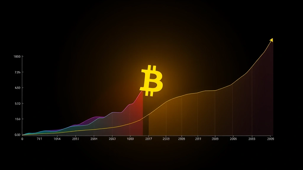
The Bitcoin Rainbow Chart stands as one of the most visually intuitive tools in cryptocurrency analysis, offering investors a unique perspective on Bitcoin’s long-term price trends and market cycles. This logarithmic regression analysis chart has garnered significant attention from both novice traders and seasoned analysts seeking to understand whether Bitcoin is overvalued or undervalued at any given moment. By mapping Bitcoin’s historical price movements across a spectrum of colors, the rainbow chart provides a fascinating framework for contextualizing price action within broader market narratives.
Understanding the Bitcoin Rainbow Chart requires grasping the intersection of technical analysis, statistical modeling, and behavioral economics. Unlike traditional candlestick charts or simple moving averages, the rainbow chart employs sophisticated mathematical algorithms to project price bands that adapt as new historical data emerges. This dynamic approach has made it increasingly popular among investors trying to identify potential entry and exit points while maintaining a long-term perspective on Bitcoin’s value proposition.
Understanding the Bitcoin Rainbow Chart Fundamentals
The Bitcoin Rainbow Chart emerged from the creative work of crypto analysts who sought to visualize Bitcoin’s price in relation to its historical average growth trajectory. At its core, the chart functions as a visual representation of logarithmic regression analysis applied to Bitcoin’s entire price history since its inception. Rather than treating price movements as linear, the rainbow chart acknowledges that Bitcoin operates in a market characterized by exponential growth phases interspersed with correction periods.
The fundamental principle underlying the Bitcoin Rainbow Chart is that Bitcoin’s price, when analyzed logarithmically over extended timeframes, follows a relatively predictable band of movement. These bands, color-coded from deep red to violet, represent different statistical deviations from the average growth trend. The chart essentially asks: “Given Bitcoin’s historical growth pattern, where should the price logically sit at any given moment?” This perspective proves invaluable for investors trying to assess whether current prices represent genuine opportunities or unsustainable valuations.
Bitcoin’s price history demonstrates distinct phases that the rainbow chart elegantly captures. During bull markets, prices tend to climb toward the upper bands (represented by greens and blues), suggesting overbought conditions. Conversely, during bear markets or consolidation periods, prices compress toward the lower bands (represented by reds and oranges), potentially indicating oversold conditions. The chart’s beauty lies in its ability to contextualize these price movements within a mathematical framework rather than relying solely on sentiment or news cycles.
The creation of the Bitcoin Rainbow Chart required analyzing years of Bitcoin price data and identifying the underlying trend. Analysts discovered that Bitcoin’s long-term price trajectory, when plotted on a logarithmic scale, creates a consistent growth channel. This observation led to the development of regression bands that automatically adjust as new price data becomes available, making the chart a living, evolving tool rather than a static historical reference.
How the Rainbow Chart Uses Logarithmic Regression
Logarithmic regression represents a sophisticated statistical technique that differs fundamentally from linear regression. While linear regression assumes prices grow at a constant rate, logarithmic regression acknowledges that Bitcoin’s growth rate itself changes over time. This distinction proves crucial because Bitcoin’s early adoption phase involved exponential growth rates that naturally decelerate as the asset matures and achieves broader market penetration.
The mathematical foundation of the Bitcoin Rainbow Chart involves calculating a logarithmic regression line through historical price data, then generating multiple standard deviation bands around this central line. These standard deviations create the rainbow of colors that give the chart its distinctive appearance. Each color band represents approximately one standard deviation from the mean, meaning that statistically, prices should remain within certain bands a predictable percentage of the time.
Understanding technical analysis principles helps clarify how logarithmic regression works in practice. The regression line itself represents the “fair value” trend that Bitcoin theoretically follows when major market distortions are removed. When prices deviate significantly from this line—either upward or downward—the chart suggests that prices may be entering unsustainable territory. The logarithmic nature means that percentage deviations matter more than absolute price movements, which makes sense for an asset that has grown from fractions of a cent to tens of thousands of dollars.
The regression bands expand and contract based on the volatility inherent in Bitcoin’s historical price movements. During periods of high volatility, the bands widen, providing more space for price fluctuations. During calmer periods, the bands narrow, suggesting that price deviations carry greater significance. This dynamic adjustment mechanism ensures that the chart remains relevant across different market environments rather than becoming obsolete as Bitcoin’s price scale changes dramatically.
Analysts typically update the Bitcoin Rainbow Chart monthly or as significant price action warrants. Each update recalculates the regression line and bands using the most recent historical data, which means the chart continuously evolves. This evolution reflects Bitcoin’s changing market dynamics and the growing dataset that informs the statistical models underlying the chart.
Interpreting the Color Bands and Market Signals
The color progression in the Bitcoin Rainbow Chart follows a logical pattern that mirrors traditional financial market signals. The deepest red bands at the bottom represent extreme undervaluation—historically rare occurrences suggesting panic selling or major negative events. Prices rarely venture into these deep red zones, and when they do, market history suggests significant recovery potential emerges.
The orange and yellow bands represent moderately undervalued territory where experienced investors often identify accumulation opportunities. These zones have historically preceded substantial bull markets, making them attractive entry points for those with sufficient risk tolerance and long-term conviction. The chart’s color coding helps traders quickly assess whether current prices fall within these favorable accumulation ranges.
The green bands represent the “fair value” zone where prices align closely with the historical growth trajectory. Prices fluctuating within green bands suggest the market is pricing Bitcoin rationally relative to its long-term trend. This zone offers neither obvious overbought nor oversold conditions, making it a neutral territory for most trading and investment strategies.
The light blue and dark blue bands represent moderately to significantly overbought conditions. Prices in these zones suggest speculative excess, though history demonstrates that Bitcoin can remain in overbought territory for extended periods during bull markets. The presence of prices in blue bands doesn’t automatically predict imminent crashes; rather, it indicates elevated risk levels and the possibility of corrections.
The violet and darkest purple bands represent extreme overbought territory—the rarest price zones in Bitcoin’s history. When prices reach these levels, the chart suggests major corrections become increasingly probable, though the timing remains uncertain. Notable bull market peaks have corresponded with prices reaching these extreme bands, providing retrospective validation of the chart’s analytical framework.
Interpreting the Bitcoin Rainbow Chart requires understanding that color bands represent statistical probability zones rather than hard price targets. The chart excels at identifying when prices deviate significantly from historical norms, but it provides less clarity on precise timing or magnitude of corrective moves. Successful investors combine rainbow chart insights with other analytical tools to develop comprehensive trading or investment theses.
Bitcoin Rainbow Chart vs Traditional Technical Analysis
The Bitcoin Rainbow Chart occupies a unique position within the broader technical analysis landscape. Unlike moving averages, which require analysts to choose specific time periods and update calculations manually, the rainbow chart employs a mathematically consistent methodology that adapts automatically to new data. This objectivity appeals to investors seeking to minimize subjective bias in their decision-making processes.
Traditional support and resistance levels, another staple of technical analysis, identify specific price points where buying or selling pressure historically emerges. The Bitcoin Rainbow Chart takes a different approach, identifying entire price bands where behavioral patterns cluster. This band-based perspective acknowledges that support and resistance aren’t infinitely precise points but rather zones where market psychology shifts.
When considering should you buy Bitcoin now, the rainbow chart provides a long-term perspective that many short-term technical indicators lack. While oscillators like the RSI or MACD may generate conflicting signals during volatile periods, the rainbow chart’s logarithmic regression maintains consistency across different timeframes and market conditions. This stability makes it particularly valuable for investors with multi-year investment horizons.
The rainbow chart also differs from trend-following systems that generate buy and sell signals based on price crossing specific moving averages. Instead, it functions as a valuation framework that helps investors contextualize prices within historical ranges. This distinction proves important because valuation frameworks provide ongoing context, while trading signals generate discrete entry and exit recommendations that may prove premature or late.
Interestingly, the Bitcoin Rainbow Chart complements rather than competes with traditional technical analysis tools. Many sophisticated traders employ the rainbow chart to assess long-term valuation while using other technical indicators to time specific entries and exits. This layered approach combines the rainbow chart’s strategic perspective with the tactical precision of shorter-term indicators, creating a more comprehensive analytical framework.
Practical Applications for Investment Decisions
Investors employing the Bitcoin Rainbow Chart typically use it as one component of a broader investment strategy rather than as a standalone decision-making tool. The chart proves most valuable for investors implementing dollar cost averaging strategies, as it helps identify periods when average purchase prices align with favorable historical valuations.
During periods when Bitcoin trades in deep red or orange bands, the chart suggests that prices represent significant discounts relative to the historical growth trend. Investors with conviction about Bitcoin’s long-term value proposition often increase their accumulation during these periods, recognizing that historical data suggests prices typically recover to higher bands over time. Conversely, when prices reach dark blue or violet bands, investors often reduce accumulation or take partial profits, acknowledging the statistical rarity of such valuations.
The Bitcoin Rainbow Chart also informs portfolio allocation decisions. Investors can use the chart to assess whether Bitcoin represents an attractive opportunity relative to other assets in their portfolios. When Bitcoin trades in red bands, allocating additional capital to cryptocurrency exposure may align with the chart’s valuation signals. When Bitcoin trades in extreme overbought bands, maintaining or reducing crypto exposure may prove prudent from a risk management perspective.
Understanding risk tolerance becomes essential when applying rainbow chart insights. Conservative investors might only accumulate Bitcoin when prices fall into orange or red bands, accepting that they may miss some gains but reducing the risk of purchasing near market peaks. Aggressive investors might maintain positions throughout the chart’s bands, using rainbow chart insights primarily to size positions rather than generate binary buy/sell decisions.
For traders seeking why Bitcoin is going up or down, the rainbow chart provides helpful context by distinguishing between temporary volatility and structural trend changes. A price movement from a green band to a yellow band might represent healthy consolidation, while a movement from green to blue bands suggests more significant appreciation potentially warranting profit-taking.
Portfolio tracking becomes more sophisticated when incorporating rainbow chart analysis. Tools available through cryptocurrency portfolio trackers can integrate rainbow chart data, helping investors visualize their cost basis relative to current valuations on the historical band spectrum. This perspective helps investors maintain emotional discipline during volatile periods by contextualizing current prices within longer-term frameworks.
Limitations and Considerations
Despite its popularity and intuitive appeal, the Bitcoin Rainbow Chart carries important limitations that investors must understand before relying on it for major financial decisions. The chart’s historical data foundation means it performs best in analyzing Bitcoin’s past; predicting future prices remains inherently uncertain regardless of analytical sophistication.
One significant limitation involves Bitcoin’s structural evolution. The Bitcoin of 2011 operated in a fundamentally different context than the Bitcoin of 2024. Regulatory developments, institutional adoption, technological improvements, and changing macroeconomic conditions all shift Bitcoin’s fundamental value proposition. The rainbow chart cannot automatically account for these qualitative shifts; it can only project historical patterns forward, which may prove misleading if Bitcoin’s future differs materially from its past.
The chart also assumes that Bitcoin’s logarithmic growth trend continues indefinitely, which may not prove true. If Bitcoin reaches market saturation or faces significant competitive threats, the fundamental growth trajectory could shift. The rainbow chart would only recognize such structural changes retrospectively, after prices had already deviated significantly from projected bands for extended periods.
Another consideration involves the chart’s reliance on logarithmic regression, which emphasizes recent data less than older data when calculating trend lines. This characteristic can create lag in the chart’s response to genuine trend shifts. During periods of accelerating or decelerating growth, the chart may underestimate or overestimate fair value until sufficient new data accumulates to shift the regression line meaningfully.
Investors should also recognize that being in a red band historically doesn’t guarantee immediate recovery. Bitcoin has occasionally remained in oversold bands for extended periods before recovering. Conversely, extreme overbought conditions sometimes precede years of sideways movement rather than sharp corrections. The chart identifies statistical extremes but provides limited insight into timing or magnitude of mean reversion.
The Bitcoin Rainbow Chart works best as one analytical tool among many rather than as a comprehensive investment system. Combining it with fundamental analysis of Bitcoin’s adoption metrics, macroeconomic conditions, regulatory environment, and technical indicators creates a more robust analytical framework than relying on the chart alone. External resources like CoinDesk provide valuable context on developments that might shift Bitcoin’s valuation independently of the rainbow chart’s historical bands.
Additionally, the chart’s effectiveness depends on data quality and calculation methodology. Different analysts may employ slightly different regression techniques or time periods, leading to variations in band placement. Investors should understand the specific methodology underlying any rainbow chart they consult rather than treating all rainbow charts as equivalent analytical tools.
Psychological factors also influence how investors interpret and act on rainbow chart signals. During bull markets, investors often rationalize why overbought conditions will persist longer than historical precedent suggests, potentially leading to excessive risk-taking. During bear markets, investors may prematurely accumulate based on oversold signals before underlying support becomes truly established. The chart provides data; human psychology ultimately determines how that data influences investment decisions.
FAQ
What does the Bitcoin Rainbow Chart actually measure?
The Bitcoin Rainbow Chart measures Bitcoin’s price relative to a logarithmic regression line calculated from its entire historical price data. The colored bands represent different standard deviations from this regression line, helping investors assess whether prices are statistically overbought or oversold relative to Bitcoin’s long-term growth trajectory. The chart essentially visualizes how Bitcoin’s current price compares to its historical growth pattern.
Is the Bitcoin Rainbow Chart accurate for predicting future prices?
The Bitcoin Rainbow Chart provides valuable context for assessing current valuations but should not be viewed as a price prediction tool. The chart identifies when prices deviate significantly from historical patterns, suggesting mean reversion may occur, but it provides limited insight into precise timing or magnitude. Many other factors including regulatory changes, macroeconomic conditions, and technological developments influence Bitcoin prices independently of historical patterns.
Can I use the Bitcoin Rainbow Chart as my only investment tool?
While the Bitcoin Rainbow Chart offers valuable insights, relying on it exclusively for investment decisions represents a risky approach. The chart works best as one component of a comprehensive investment strategy that incorporates fundamental analysis, risk management principles, and understanding of your personal risk tolerance and investment timeline. Combining the rainbow chart with other technical indicators and analytical frameworks creates more robust decision-making processes.
How often should I check the Bitcoin Rainbow Chart?
The frequency of checking the rainbow chart should align with your investment approach. Long-term investors might review it monthly or quarterly, using it primarily to assess whether current valuations support accumulation or suggest taking profits. Active traders might monitor it daily but should combine it with shorter-term technical indicators. Obsessively checking the chart can lead to emotionally-driven decisions that contradict your investment strategy.
What does it mean when Bitcoin price enters the red band?
When Bitcoin enters red bands, the chart suggests prices have fallen significantly below the historical growth trend, indicating potential oversold conditions. Historically, such periods have preceded substantial recovery rallies. However, the chart doesn’t specify timing or magnitude of recovery. Red band periods may persist for weeks or months before recovery materializes, so investors should maintain adequate risk management and not assume immediate price appreciation.
Should I sell Bitcoin when it reaches the purple band?
The purple band indicates extreme overbought conditions historically rare in Bitcoin’s price history. While prices reaching this zone suggest elevated correction risk, history demonstrates that Bitcoin sometimes remains overbought for extended periods during strong bull markets. Selling decisions should incorporate multiple factors including your investment timeline, risk tolerance, and portfolio allocation rather than relying solely on reaching purple bands.