The Bitcoin Rainbow Chart has become one of the most discussed technical analysis tools in the cryptocurrency community, particularly among long-term Bitcoin investors seeking to identify optimal entry and exit points. This logarithmic visualization overlays Bitcoin’s historical price data with color-coded bands representing different valuation zones, from deep red (oversold) to dark purple (overbought). But despite its popularity and intuitive visual appeal, the fundamental question remains: is the Bitcoin Rainbow Chart truly a reliable indicator for investment decisions, or is it merely an entertaining representation of price history that can mislead traders?
Understanding the Bitcoin Rainbow Chart requires examining both its methodology and its track record. The chart was created by crypto analyst Plan B and has evolved significantly since its introduction. It uses logarithmic regression to smooth Bitcoin’s price movements across years of data, creating bands that theoretically represent different market phases. However, many investors fail to recognize that past performance and visual patterns, no matter how compelling, do not guarantee future results in volatile cryptocurrency markets.

What is the Bitcoin Rainbow Chart?
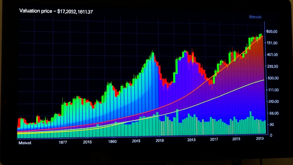
The Bitcoin Rainbow Chart is a logarithmic price chart that displays Bitcoin’s historical price movements overlaid with multiple colored bands or zones. Each color represents a different valuation stage, theoretically indicating whether Bitcoin is undervalued, fairly valued, or overvalued at any given time. The chart ranges from deep red at the bottom (representing severe undervaluation) through orange, yellow, green, blue, and cyan, finally reaching dark purple at the top (representing extreme overvaluation).
This visualization tool attempts to provide investors with a quick visual reference for market sentiment and valuation levels. The underlying premise is that Bitcoin follows cyclical patterns influenced by halving events, market sentiment, and adoption cycles. By mapping historical prices onto these bands, the chart creator theorized that investors could identify potential buying opportunities (red zones) and selling opportunities (purple zones).
The chart gained significant traction during the 2017 bull market and has remained popular among the cryptocurrency community as a free, accessible tool. Many online platforms now offer variations of the Bitcoin Rainbow Chart, making it widely available to retail investors who may lack access to sophisticated trading terminals or institutional research.

How Does the Rainbow Chart Work?
The Bitcoin Rainbow Chart employs logarithmic regression analysis, which is fundamentally different from simple linear analysis. Logarithmic scaling compresses larger price ranges while expanding smaller ones, allowing the chart to display Bitcoin’s entire price history—from early pennies to thousands of dollars—on a single viewable graph. This mathematical approach acknowledges that percentage gains matter more than absolute dollar movements in cryptocurrency markets.
The color bands are generated using a logarithmic function that calculates Bitcoin’s long-term trend line. Rather than using a fixed price point, the bands are positioned based on standard deviations from this trend line. According to the chart’s methodology, prices that deviate significantly from the trend line (either above or below) are considered extreme and likely to revert toward the mean over time.
The chart typically includes bands representing: deep red (panic selling, strong buy signal), red (undervalued), orange (moderately undervalued), yellow (approaching fair value), green (fair value), blue (moderately overvalued), cyan (overvalued), and dark purple (bubble territory, strong sell signal). Each band theoretically represents psychological and market conditions that have historically preceded price reversions.
However, it’s crucial to understand that the bands are created retroactively from historical data. The chart looks at where Bitcoin has traded in the past and then assigns colors to those zones. This means the bands are essentially describing what has happened, not necessarily predicting what will happen in unprecedented market conditions.
Is It Actually Reliable?
The reliability question demands honest examination of both successes and failures. During several periods, the Bitcoin Rainbow Chart did provide useful signals. In 2015, Bitcoin spent considerable time in red and orange zones before the subsequent bull market. Similarly, in late 2018 and early 2019, Bitcoin touched deep red zones before recovering. These instances generated enthusiasm among chart proponents and attracted new followers.
However, the chart has also produced spectacular failures. During the 2021 bull market, Bitcoin remained in cyan and purple zones for extended periods while continuing to reach new all-time highs. This violated the chart’s fundamental premise that extreme zones represent imminent reversals. Investors who strictly followed the chart’s signals by selling in cyan zones during 2021 would have missed substantial further gains.
Research into technical analysis reliability, as covered by CoinDesk, consistently shows that no single indicator—including the Rainbow Chart—reliably predicts price movements with statistical significance. The chart’s apparent accuracy during certain periods likely reflects confirmation bias, where investors remember correct predictions while forgetting incorrect ones.
The fundamental problem is that the Bitcoin Rainbow Chart assumes Bitcoin’s price movements follow consistent cyclical patterns. While Bitcoin has demonstrated some cyclical behavior related to halving events, external factors—regulatory developments, macroeconomic conditions, institutional adoption, technological breakthroughs, and black swan events—can dramatically alter expected patterns. The chart cannot account for these unpredictable variables.
When evaluating reliability, consider that the chart was created and has been refined based on historical data Bitcoin has already produced. This creates a form of data snooping bias, where patterns that appear meaningful in historical data may not persist in future data. The chart essentially fits a curve to the past and assumes that future price action will follow the same curve—an assumption that becomes increasingly questionable as Bitcoin matures and market conditions evolve.
Key Limitations and Risks
Understanding the Bitcoin Rainbow Chart’s limitations is essential for any investor considering using it for decision-making. The most significant limitation is that it treats Bitcoin as though its fundamental value follows a predictable mathematical function. In reality, Bitcoin’s value emerges from complex interactions between supply, demand, sentiment, utility, regulation, and macroeconomic factors—none of which are perfectly captured by a logarithmic regression of historical prices.
The chart also assumes that Bitcoin’s adoption curve will continue following historical patterns. However, Bitcoin has already achieved mainstream awareness and institutional adoption that didn’t exist in earlier cycles. This fundamentally altered market dynamics. Future cycles may not resemble past ones, rendering historical band positions less predictive of future behavior.
Another critical limitation involves the arbitrary nature of band selection. While logarithmic regression provides a mathematical framework, the specific colors and their boundaries involve subjective decisions about what constitutes “overbought” or “oversold.” Different versions of the chart exist with slightly different parameters, highlighting this subjectivity. No universal agreement exists about exactly where the bands should be positioned.
The chart also fails to account for risk tolerance differences among investors. A young investor with a 20-year time horizon might rationally ignore purple zone warnings and continue accumulating Bitcoin, while a retiree might need to sell regardless of chart signals. The chart cannot provide personalized guidance based on individual circumstances.
Additionally, the Rainbow Chart ignores critical factors affecting investment decisions, such as asset allocation requirements and portfolio diversification needs. An investor might need to reduce Bitcoin exposure not because the chart indicates overbought conditions, but because their overall portfolio has become too concentrated in cryptocurrency.
Practical Application for Investors
If you’re considering using the Bitcoin Rainbow Chart, it should only function as one input among many in a comprehensive investment analysis framework. The chart works best as a visual context provider rather than a primary decision-making tool. When Bitcoin enters deep red zones, it’s worth investigating why prices have declined so severely. Similarly, purple zone extremes warrant research into what fundamental or sentiment-driven factors have driven such high valuations.
For those interested in how to invest in cryptocurrency, the Rainbow Chart can serve as an educational tool that illustrates Bitcoin’s long-term price trajectory and volatility. It can help newer investors understand that extreme price movements, while psychologically challenging, are normal for Bitcoin. This perspective can prevent panic selling at market bottoms.
However, using the chart for precise entry and exit timing is unreliable. The bands are wide, and Bitcoin can remain in any particular zone for extended periods. Attempting to time the exact moment Bitcoin transitions from one band to another is futile. Markets don’t respect predetermined color boundaries.
A more rational approach involves setting investment goals based on personal financial circumstances, then using dollar-cost averaging or other systematic approaches rather than chart-based timing. For long-term investors, the chart’s precise signals matter less than maintaining disciplined allocation and rebalancing strategies.
Combining the Rainbow Chart with other analysis methods strengthens decision-making. Fundamental analysis examining Bitcoin’s adoption metrics, network growth, and use cases provides different insights than chart-based technical analysis. Macroeconomic analysis considering inflation, interest rates, and currency devaluation offers additional context.
Alternative Analysis Methods
Beyond the Rainbow Chart, investors should familiarize themselves with alternative approaches to Bitcoin analysis. On-chain analysis examines Bitcoin blockchain data—transaction volumes, wallet movements, miner behavior—to understand actual usage patterns rather than relying solely on price charts. Fundamental analysis evaluates Bitcoin’s technology, adoption rate, and competitive positioning relative to other cryptocurrencies and assets.
Macroeconomic analysis considers how broader economic conditions affect Bitcoin demand. During periods of currency devaluation or negative real interest rates, Bitcoin often benefits as investors seek inflation hedges. This approach requires monitoring central bank policies and economic indicators rather than staring at price charts.
Sentiment analysis examines market psychology through social media, news flow, and trading volumes. Extreme sentiment readings (either excessive euphoria or panic) often precede reversals, though not with perfect reliability. Unlike the Rainbow Chart, sentiment analysis focuses on what market participants currently feel rather than where prices have been.
For comprehensive portfolio management, diversifying your investment portfolio reduces reliance on any single indicator. A portfolio containing Bitcoin, other cryptocurrencies, traditional assets, and cash positions provides stability that chart-watching cannot achieve. Proper diversification requires understanding what cryptocurrency represents in your overall wealth strategy.
Professional investors increasingly use machine learning models that incorporate multiple data sources simultaneously. These models analyze thousands of variables—price action, on-chain metrics, sentiment indicators, macroeconomic factors, regulatory developments—to generate probabilistic forecasts rather than definitive predictions. While imperfect, this approach acknowledges the complexity that simple charts cannot capture.
Resources like Blockchain.com provide on-chain analysis tools, while Glassnode offers sophisticated blockchain metrics for serious investors. These platforms provide data-driven insights that complement or challenge chart-based analysis.
FAQ
Does the Bitcoin Rainbow Chart actually predict price movements?
The Bitcoin Rainbow Chart does not predict price movements with reliable accuracy. It visualizes historical price data in relation to a logarithmic trend line, creating an appearance of predictive power that is largely illusory. While the chart sometimes coincides with price reversals, it frequently fails during extended bull markets or periods of rapid adoption. No technical indicator reliably predicts cryptocurrency prices.
Should I use the Rainbow Chart to time my Bitcoin purchases?
Using the Rainbow Chart for precise timing is unreliable and often counterproductive. Research consistently shows that timing markets is extremely difficult, even for professional traders. Instead, systematic approaches like dollar-cost averaging—investing fixed amounts at regular intervals regardless of price—historically outperform timing attempts. The Rainbow Chart might inform the context of your investment, but shouldn’t be your primary decision driver.
What’s the difference between the Rainbow Chart and other technical indicators?
The Bitcoin Rainbow Chart differs from most technical indicators by using logarithmic regression on historical data rather than calculating momentum or volatility from recent price action. Indicators like RSI (Relative Strength Index) or MACD focus on short-term momentum, while the Rainbow Chart attempts to identify long-term valuation extremes. However, all technical indicators share the fundamental limitation of being retrospective tools applied to prospective predictions.
Can the Rainbow Chart work alongside fundamental analysis?
Yes, combining the Rainbow Chart with fundamental analysis creates a more balanced approach. The chart can provide valuation context while fundamental analysis examines whether Bitcoin’s technology, adoption, and use cases justify current valuations. For example, if the chart indicates purple zone overbought conditions but fundamental metrics show accelerating adoption, the situation warrants deeper investigation rather than automatic selling.
Why do some investors swear by the Bitcoin Rainbow Chart?
Investors often develop strong attachments to tools that have helped them profit, sometimes attributing success to the tool rather than favorable market conditions or luck. The Rainbow Chart’s visual appeal and intuitive color scheme make it emotionally satisfying to use. Additionally, confirmation bias leads investors to remember occasions when the chart provided correct signals while forgetting failures. These psychological factors explain the chart’s continued popularity despite limited predictive reliability.
Is the Bitcoin Rainbow Chart suitable for day traders?
No, the Rainbow Chart is unsuitable for day trading. Its logarithmic scale and focus on long-term trends mean it provides little useful information for intraday price movements. Day traders require indicators that respond to short-term momentum and volatility. The Rainbow Chart is better suited for long-term investors considering multi-month or multi-year positions.